Below is a chart that tracks two simple numbers over the years, each with their own vertical scale (click to enlarge):
- The average household’s equity ownership share, as a percentage of total equity and credit (bond) assets. (Left-axis)
- The subsequent 10-year average annual return of the S&P 500 index. (Right-axis)

Kind of eery, right? As the relative demand for stocks goes up, their future return goes down. This is the most up-to-date version of the chart that I’ve seen – credit via . The first time I recall seeing this chart was 5 years ago in this .
Since then, this by Yang and Zhang found that “Household Equity Share” was a better predictive tool than the CAPE or PE10 ratio. Most recently, had a thoughtful piece on why using this correlation to time the market would be very difficult (you’d have to be out of the market for a long time, and during some great bull markets). Here’s another way to show this relationship:
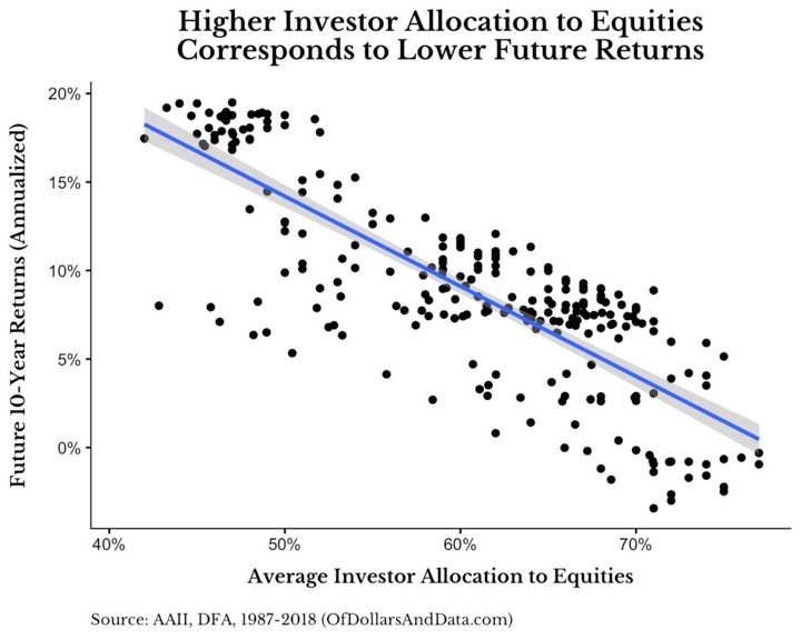
(I’m not sure the x-axis labels on this last chart are correct, as it doesn’t agree with the first chart that tops out at 55% household equity share.)
This will be an interesting chart to track over time. Overall, it is yet another indicator that points to the average return of US stocks for the next 10 years to be rather muted (in the low single digits!). But again, anything could happen – both higher or lower – in the short-term.
“The editorial content here is not provided by any of the companies mentioned, and has not been reviewed, approved or otherwise endorsed by any of these entities. Opinions expressed here are the author’s alone.”
from .
Copyright © 2018 MyMoneyBlog.com. All Rights Reserved. Do not re-syndicate without permission.