User Experience (UX) designers need to conduct a lot of research for their job — a process is made easier using customer mapping and affinity diagrams.
An affinity diagram is a mapping method that helps your designers understand customers and provide a better user experience.
Below, we’ll cover what an affinity diagram is and how its mapping can assist your UX design team.
Skip to:
Your diagram can include information like data, facts, customer interviews, user insights, and design issues. Additionally, an affinity diagram helps you organize and group information into categories so you can quickly make sense of the data.
When to Use an Affinity Diagram
Typically, affinity diagrams are used as a brainstorming exercise, or to analyze large data sets as a team. A UX designer might use an affinity diagram when they’re searching for a group consensus, large issues are presented, or when there are many ideas being thrown around.
UX designers must conduct extensive research from user interviews to . Once that research is complete, using an affinity diagram can help gather all the data you need to brainstorm new ideas that’ll improve your customer’s journey. Want to learn more about user testing?
If you’re working on a project that seems chaotic, an affinity diagram can help create, design, and organize information. This diagram keeps track of all your team information and gives you an overarching view of your research.
It’s best to use an affinity diagram when:
- The problem you are trying to solve is complex.
- The problem requires analysis of large data sets and observations.
- The problem involves sorting ideas by theme.
- The problem requires the support of a team or group.
- The problem you are trying to solve is overwhelming and runs the risk of becoming disorganized.
If you nodded yes to all of these, an affinity diagram will help you and your team organize your thoughts and strategize the best course of action.
So, how is an affinity diagram created? Before you can get started, let’s learn about the process below.
To make the mapping process easier, you can opt to use a template or follow the steps below.
How to Create an Affinity Diagram
1. Record each idea on sticky notes.
To begin the mapping process, you’ll want to have a brainstorm session, writing out ideas and information on movable blocks, like sticky notes. You can spread these out on a table or whiteboard, just make sure they are visible to the rest of the participants.
2. Group related ideas into categories.
Once you’ve gathered enough ideas, start to look at themes or similarities between them. Have participants sort each sticky note based on its relationship to each other into multiple groupings. It’s okay to have some outlier ideas that don’t naturally fit into your groupings. You may find that some ideas can fit into two groups, and in this case make another sticky note with the same idea and continue your groupings.
For best results, do this process without speaking so everyone can focus on the relationships between each idea.
3. Discuss and organize with your team.
Once you’ve compiled your groupings, it’s time to discuss your thoughts with the other participants. You can brainstorm headings for each grouping you came up with and whether or not everyone agrees with the current groupings.
You can also use this time to discuss any trends or patterns you found, discrepancies in groupings, or move ideas.
4. Assign ideas to their corresponding category.
Now that your sticky note groupings are finalized, it’s time to finalize their categories. Assign all ideas to the appropriate corresponding category.
By going through the affinity mapping process, you’ll find trends in your research, learn more about your customers, and brainstorm new ideas to make the user experience better.
Before you get started with your affinity diagram, let’s review some best practices to help you do it right the first time.
Affinity Diagram Best Practices
1. Assign a moderator.
These meetings can run long if you don’t keep track of time. Plus, some team members might end up monopolizing the conversation with new ideas. The moderator should make sure everyone is contributing and keep track of time so the meeting doesn’t last too long.
2. Designate a scribe.
Delegating a scribe can help you keep track of the best ideas. Writing on hundreds of sticky notes then organizing them can be overwhelming. So, a scribe will make sure you don’t lose track of the most important information.
3. Summarize your findings.
At the end of the meeting, summarize your findings for each category. Figure out what your top conclusions were and the solutions you brainstormed during the session. This will help you quickly derive value from your meeting.
4. Put it online.
If you don’t want to lose track of the affinity diagram, you can make one online. You can use flow charts or software like to draw out your diagram. Visualization tools make it easy to monitor your research after having an hour-long diagram session.
Now that we’ve covered the affinity diagram process, let’s see what this looks like in action.
Affinity Diagram Examples
1. New Ideas Affinity Diagram
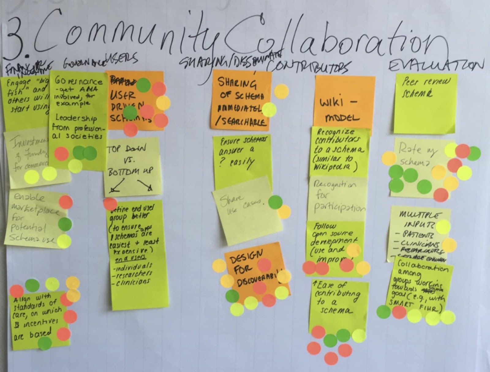
In the image above, a UX team brainstormed ideas about community collaboration. As you can see, community collaboration is just one of the categories that they were discussing. That category was then dissected into three subcategories including users, contributors, and evaluation.
In this example, the UX team also used voting stickers for everyone to rate the best ideas in the diagram. By using an affinity diagram, this team was able to gather their ideas for the UX design team to improve the customer journey.
2. Customer Journey Affinity Diagram
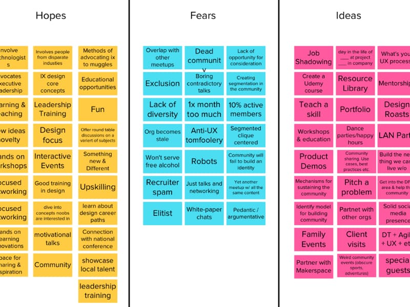
Unlike the first example, this one is focused on the . With an affinity diagram like this, the UX team can consolidate research learned from customer interviews and user insights. Learning about the pain points and motivations of your customers will help your UX team brainstorm new ideas to help users in their journey.
In this example, you can see the UX team separated their research into three categories including hopes, fears, and ideas. These categories help the team understand its target market on a deeper level. Plus, the UX team can see hopes, fears, and ideas at a glance, which makes it easier to brainstorm solutions.
3. Organizational Affinity Diagram
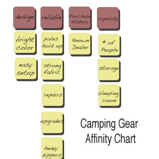
All in all, affinity diagrams are used to organize and gather information. In this example, you can see everything you need to know about purchasing camping gear. This diagram reviews key factors to keep in mind including fabric, set-up, sleeping room, and cosmetic elements like color and zipper.
This diagram gets to the heart of what an affinity diagram is for: keeping information organized so you can see data at a glance when you’re trying to brainstorm solutions. It also features several subcategories to keep data organized.
While looking at examples is helpful, you might still have questions about how to create an affinity diagram. Let’s review some templates to get you started.
Affinity Diagram Template
1. Virtual Whiteboard Affinity Diagram
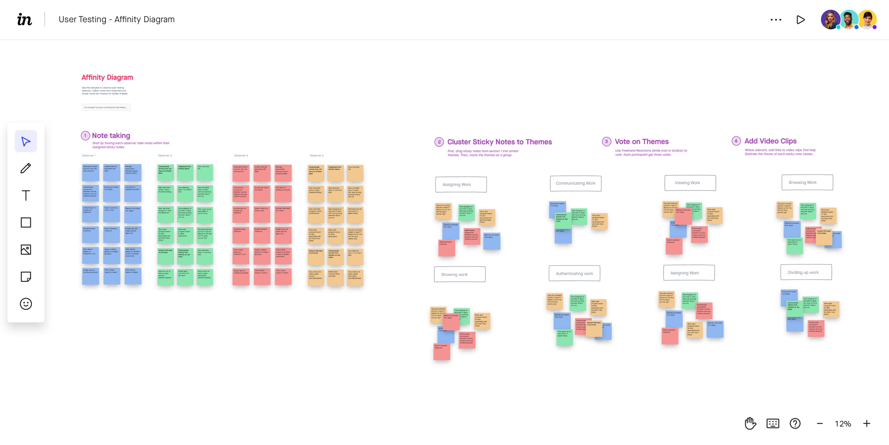
This template from and InVision takes the guess work out of creating an affinity diagram. The best feature about this template is that it’s perfect for collaboration, allowing participants to add their ideas on virtual sticky notes in real time.
Simply input the data from your research onto a sticky note and have participants sort them as needed. Using the reactions feature, everyone can vote on each category or group’s priority. You can also add videos, photos or other visual content to this template.
2. Hierarchical Affinity Diagram
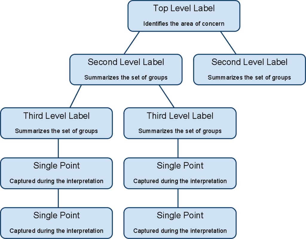
In this template, the affinity diagram is organized by hierarchy. With this structure, you can create as many categories and subcategories as you need.
If you use this type of affinity diagram, make sure that you let the categories form themselves naturally. Don’t limit yourself with preset categories and subcategories. Those categories should make themselves apparent as you start grouping information.
3. Color-Coded Affinity Diagram
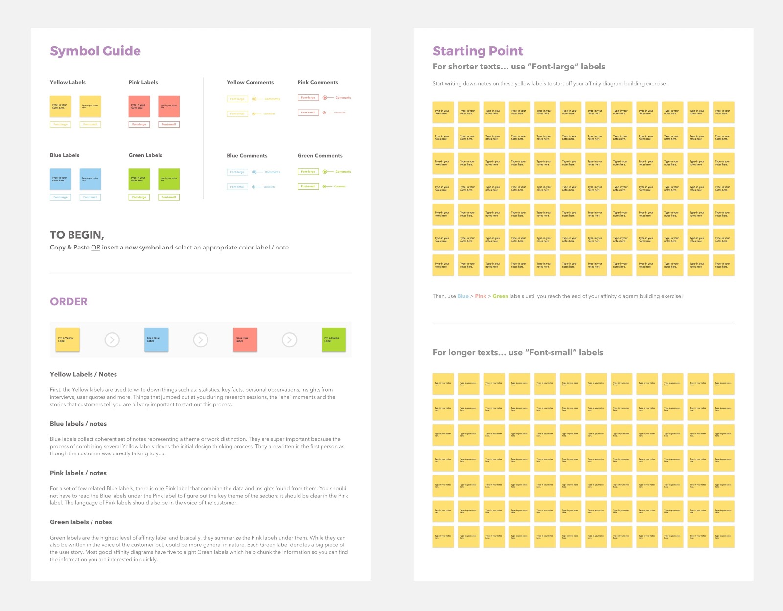
In this template, UX Planet organizes its affinity diagram by color-coding. It suggests using several-color sticky notes to arrange your ideas.
You could assign a color for stats, user interviews, and ideas. Or, you label your hierarchy affinity diagram with colors for each category. The subcategories could be one color while the categories underneath are a different one.
Whatever you choose, color coding your affinity diagram can be helpful when you’re organizing your research.
4. Blocks Affinity Diagram
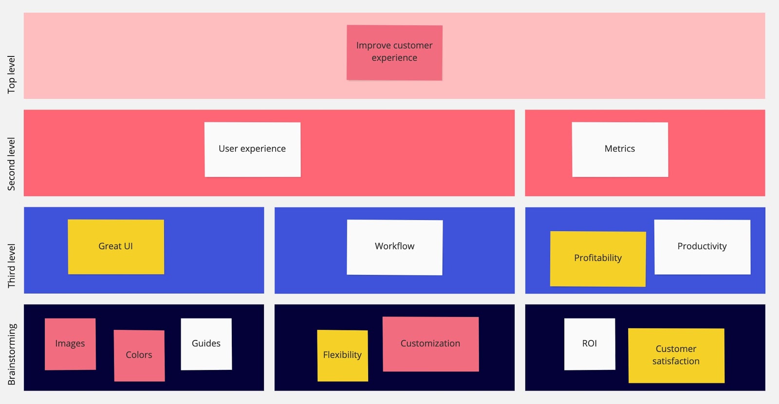
This template organizes information in blocks, starting with high-level ideas and narrowing them down to more in-depth notes.
You can organize your ideas by stats, product ideas, profitability, customization, or customer satisfaction. This helps you brainstorm new ideas while also keeping in mind ROI and the customer journey.
Affinity Diagrams Are Powerful Business Tools
While affinity diagrams are often used in UX, it’s a method that has multiple use cases, including project management. If you’ve got a difficult problem to solve, affinity mapping can help you quickly organize your ideas and insights.
Editor’s note: This post was originally published in October 2019 and has been updated for comprehensiveness.
![]()