
Periodically, Vanguard publishes asset class return forecasts for the next 10 years. Here is their most recent one for . To their credit, they have also published a recent tracking both those forecasts alongside the actual returns in retrospect. This is a good lesson on the difficulty of any sort of short-term market prediction, even after allowing yourself 10 years and wide error bars.
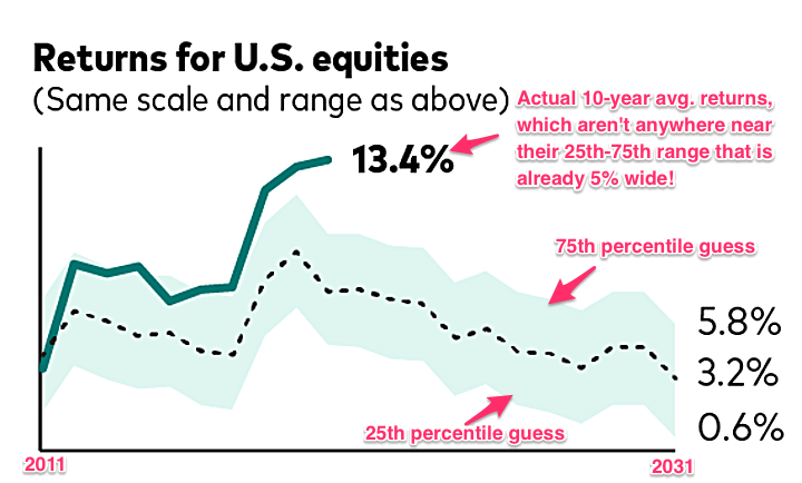
Below is a chart tracking their forecasts for the future 10-year average annualized returns of US stocks. Eyeballing their chart, for 2010-2020 their range of confidence was somewhere between roughly 5% and 10% annually, for a median around 7.5%. This accounts for their model’s 25th percentile to 75th percentage range of possible outcomes. This is a pretty big range! $100,000 times 5% annualized returns after 10 years is $163,000. $100,000 times 10% annualized returns after 10 years is $259,000.
Even accounting for that wide range, their forecast for US stocks was off. While the curve looks vaguely similar, US stocks did significantly better than their forecast:
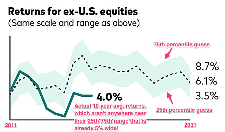
Again, even accounting for the huge range of guesses, their forecast for international stocks was also off. Global non-US stocks did significantly worse than their forecast:
Vanguard’s original chart focuses on their 60/40 portfolio, which happens to look a lot better. Why? Their 60/40 portfolio consists of 36% US equities, 24% global ex-US equities, 28% US bonds, and 12% ex-US bonds. For one, future bond returns are much more simple to predict than stock returns. Your current 10-year yield is going to be pretty close to your eventual 10-year return. In addition, their US equities forecast was really wrong in one direction (too low), while their international equity forecast was wrong in the other direction (too high), so they tended to offset each other. Is this diversification in action? Certainly, yes, but also luck in my opinion. Both could have also been wrong in the same direction.
Should we just ignore this stuff completely then? I keep thinking back to this illuminating chart comparing the to the total return of the S&P 500. Earnings growth and dividends have been pretty consistent for over 70 years, but the overall swings in return have been mostly caused by P/E ratio expansion and contraction.
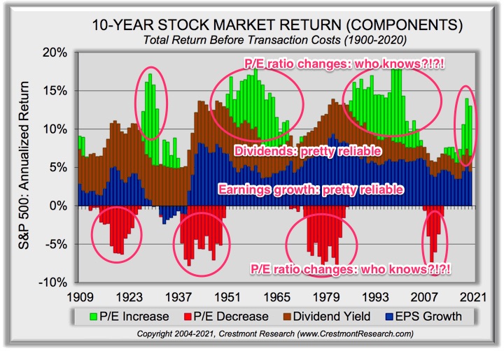
Consider the analogy that P/E ratio expansion and contraction behaves like a rubber band. It can stretch pretty far, much farther than you might expect, but as you keep stretching it, the stronger it will eventually want to come back. But you never really know how far it can stretch, or when it will snap back. Forecasts can be wrong for a long, long time. You have to balance knowing that the run will end eventually, but not knowing when. Someone will always be right in retrospect.
If only we could focus solely on the earnings growth and dividends. Those are what really matter in the long run. This is the behavioral benefit of remembering that dividends are a share of profits being distributed to you as a business owner. Even if prices on a screen are dropping, the businesses are still working hard, making profits, reinvesting some for more earnings growth, and sending some of it to you as cash.
“The editorial content here is not provided by any of the companies mentioned, and has not been reviewed, approved or otherwise endorsed by any of these entities. Opinions expressed here are the author’s alone. This email may contain links through which we are compensated when you click on or are approved for offers.”
from .
Copyright © 2004-2021 MyMoneyBlog.com. All Rights Reserved. Do not re-syndicate without permission.